Hunter Rayne
hunterbenson216@gmail.com | (210) 748-8528
fashion and technical design.
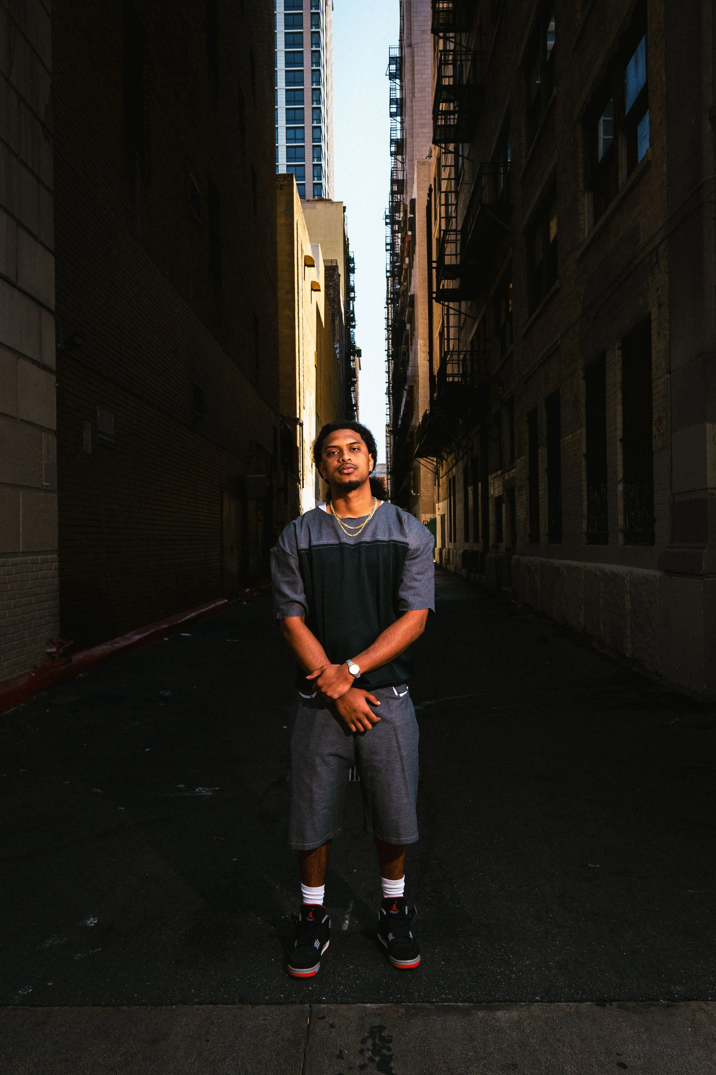
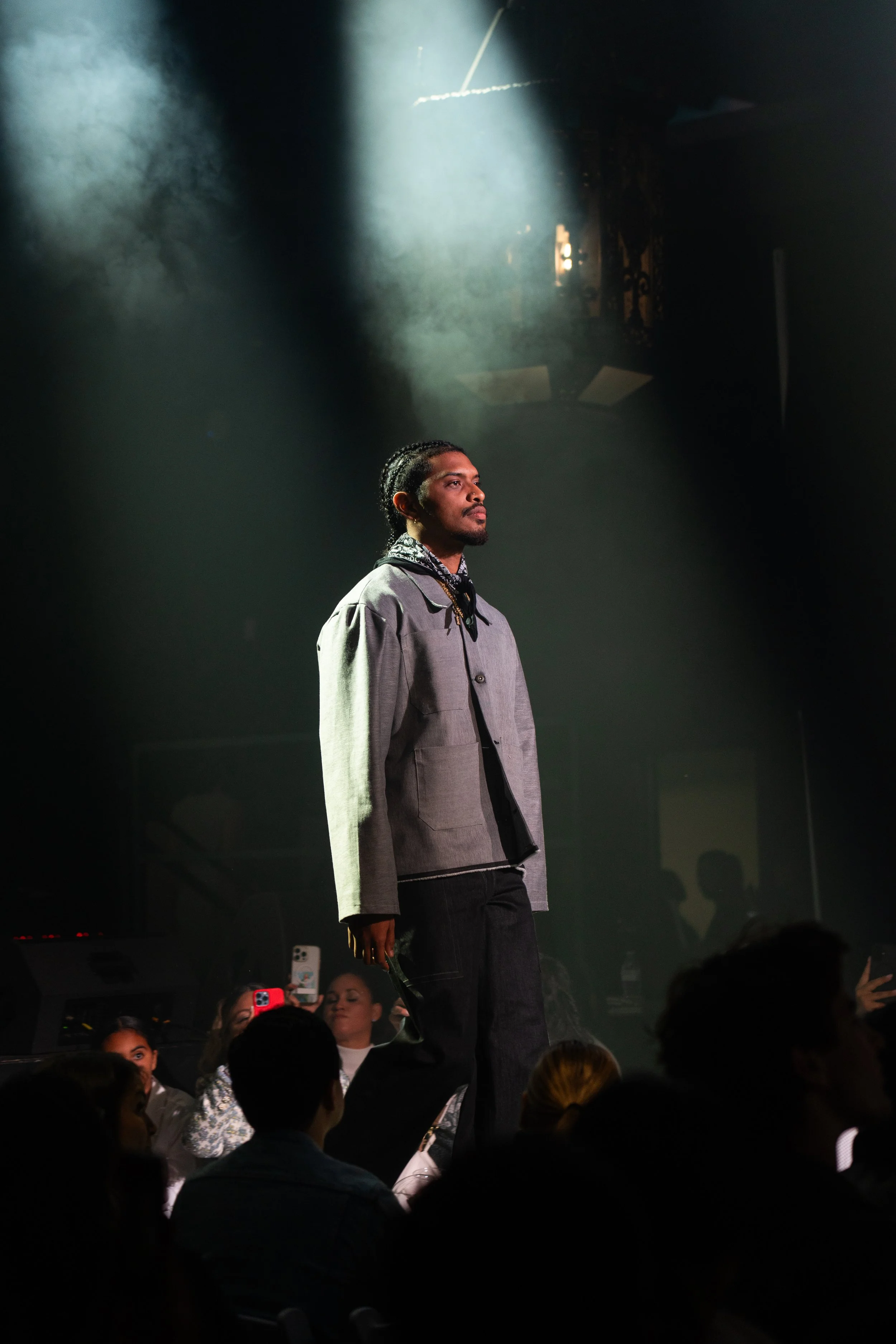
“(Broken) Hearts” Cargo Pant
(Dec. 2020) This was my first project created after learning Adobe Illustrator. Made in Illustrator, The “(Broken) Hearts cargo pant” was created as my interpretation of where I would like to see the cargo pant head at the time. Known for its durability and comfort, I wanted to see cargo pants incorporate more design changes to the garment that would complement the existing design features cargo pants already offer. At the time, I was inspired by the concept of love and the various forms it takes within our lives and felt that the qualities people like about cargo pants are the same qualities we like about love. As a result, I created three different colorways that the pant would be created in: army camo, desert camo, and black. The camo designs incorporate an all-over enlarged asymmetrical heart design that are the same color as the pants themselves. The black design incorporates a similar design with the main difference being the “crack” effect down the center of the heart as well as the enlarged asymmetrical heart design being red and smaller white, accent asymmetrical hearts. All the designs would incorporate custom asymmetrical heart pockets with silver buttons.
As a technical sketch, there was a lot of room for improvement. Stitch lines missing and the garment itself being asymmetrical are two of the major things I noticed amongst other details that could be seen upon closer inspection. Nevertheless, this was the design that sparked a fire in me to seriously pursue this career.
“To Inspire” Varsity Jackets
(June 2021). This marked my second attempt at creating a piece based around a theme. The design for this garment played off of the idea I had for a brand name, Muse, as well as as the idea that one has to be protective of their thoughts and creations. The “M” on the left arm is a more direct reference to the brand name and color-matched to self fabric. The phrase “Inspirar” connects to the concept of a muse being a source of inspiration and the phrase itself advocating for people to inspire, thus creating a loop of inspiration with everyone partaking in both roles, the inspired and the inspiree. Other design elements include various form of protective eyes from different cultures around the world; this was done with the idea of protecting one’s thoughts and ideas from anybody giving an envious eye to them. The brain logo with the “pow” like effect behind it are supposed to be representative of an “ah-ha” moment when someone is hit suddenly with inspiration. The varsity jacket itself would have a self fabric of cotton/wool while the sleeves would be tumbled leather that resembles the same leather used on professional basketballs. There is also ribbing on the bottom of the garment and the neckline that is color-matched to the self, while ribbing is also used to create the cuff on the sleeves.
While I still like this design years later, there are some changes I would like to make to the design as well as improve the technical sketch before having it put into production of any sort. Starting with the design elements, I would look for other ways to implement the eye designs. One way I was thinking of doing this was by creating a varsity patch that would help the design look more subtle in my opinion as well as help tie the elements more into the varsity jacket style. I would either do the same thing with the brain and “pow” effect or just completely redesign it.
As for the technical sketch, one thing I would focus on is making sure that the weight of the lines are the proper weight for the part of the garment it’s being used for. Another thing I could improve is the size of the ribbing. I was so determined to make sure that the ribbing was easily seen in the technical sketch that I made it a little to large, so for a revised version of this technical sketch I would make sure that everything is proportionate.
“Eve” Zip-up Hoodie
(July 2021). The “Eve” zip-up hoodie was my take on an oversized zip-up hoodie with a little biblical inspiration put into it. Starting with the most notable details, the three women are pretty straight-forward representations of demons, people, and angels. The stacking of designs, as well as the gradual change in color between the three designs, is supposed to be symbolic of the transition between the three types of beings. Emphasizing this point even more is the horns seen on woman on the front of the jacket, the woman on the back of the jacket with a halo, and the woman on the middle with no unique features. Two of other notable details is the customized apple zip and the general placement of the three women. Both are a nod to the biblical narrative of creation with the apple being the fruit people generally agree was eaten and the placement on the ribs being a nod to the creation story of man. This garment would be created out of a medium-heavy weight cotton fabric with color matched, rib knit fabric on the cuffs and bottom hem. The garment would also be double-lined similar to how the YZYGap zip-ups are constructed
One of the improvements I’d like to make to this technical sketch is how the halo overlaps the hood on the back and how the woman overlaps the left pocket on the front. I would go back and re-layer everything so that those items were sent backwards and the garment would be more accurate to the envisioned final product. I would also add ribbing detail to the areas of the garment that need it (i.e. cuffs and bottom hem)
“Eros” Bomber Jacket
(July 2021.) The “Eros” bomber is my interpretation of Starter jackets popular throughout the 80s and 90s. I personally enjoy these jackets because it combines streetwear, sports, and minimal details in a way that creates a garment that can both amplify an outfit as well as serve as the staple piece within the outfit.
For this specific design, I wanted to keep the aesthetic and overall feeling as close as I could to the classic Starter jacket design which is why the color scheme is pretty simple, but still loud and the branding details are exaggerated to the point where they could be seen from a distance. The self-fabric for this garment would be a satin exterior because the luster that would be added to the garment would help the color to pop more. It’s not pictured in either sketch drawing, but the interior would also have a quilted lining. A knit ribbing fabric would be used on the cuffs, neck, and bottom hem of the garment as well as would have a stripped pattern. The “Muse” script across the front of the jacket would be embroidered, as well as both the angel and hearts on the back of the garment. The hearts and the snap-on buttons would be color matched to the self fabric, while the angel would be color matched to the “Muse” script.
One of the improvements I would make to the sketch drawing is that I would go back and check to make sure that the garment is balanced and everything is symmetrical. I would also go back and add a line to indicate the sleeves are separated from the body. Another change I would make is that I would go back and try connecting all the letters into a single object instead of having them be four separate objects overlayed one another. I think this would make the transition between letters smoother and improve the overall design.
“Industrial T-shirt” Tech Pack
(July 2023). This was my first attempt at making my own tech pack for a shirt that I got made. At the time I had no idea exactly what pages were needed, so I looked up a youtube video and put in the information that I thought was most important: the general information, the artwork placement, the artwork details such as the color, and the size chart. The size chart was the simplest because I was printing on blanks so I just made a reference to the garment I was using at the time. For the artwork, this was my first attempt at making a design with gradient fill. Since the theme of the shirt is dealing with metalwork, I tried making the logo look like polished medal.
For it being my first attempt and not much information needed to be entered, this tech pack was pretty good but could still use some improvements. One of the changes I would make is to try and keep the artwork as proportional as possible. I’d also like to think of a way to better communicate the color used in the designs.
Post-Production Thoughts: I also learned that I have to be aware of the size limits of designs when I’m printing. I got lucky because this print was designed to take up the entire back, and while the printing press used couldn’t accommodate the exact measurements I wanted, it got pretty close.
“Lone Star T-shirt” Tech Pack
(July 2023). This and the “Industrial” T-shirt were my first attempts at bringing one of my designs to life and creating a techpack for them as if I was going to put them into mass production. This design is pretty direct and pays homage to my Texas ties.
The flag is designed as if the light is reflecting off it, creating a gradient effect. The star has been replaced with the Seal of Solomon logo I was playing with as the initial brand staple logo. Under the design is the phrase, “The Lone Star shines the brightest” referencing the nickname of Texas; this phrase was made with the intent of wanting people to embrace doing things by themselves. On the front chest pocket area is a “Muse” typograph that also uses a gradient fill based on the colors of the Texas flag.
For being one of my first attempts, I’m pretty pleased with the outcome of both the shirt itself and the techpack made for it. There are still improvements that could be made, but this project helped me get more comfortable with communicating my designs and ideas to someone who is responsible for making them come to life.
“Button Down Shirt” Tech Pack
(July 2023.) This was my first, and currently only, attempt at luxury. I created this garment with the vision of having it be worn to a nice dinner, where the dress code is more strict and the person going must be seen as presentable by the restaurant workers.
Speaking on the design itself, I tried to keep it simple while allowing the details to be the thing that draws in the attention of people. This is essentially my take on minimalism. To begin, I picked the color of forest green because I find it calming while still promoting a feeling of luxury. Rather than use a neutral color like most designs would have, I still wanted to incorporate a color that would stand-out while not yelling “Look at me!.” Next, I incorporated white pinstripes into the design as a way to create some contrast into the garment instead of it just being a singular color. The Star of David logo was intended to be gold for no reason besides the fact that I liked the way it went with the color scheme. Both the pinstripes and the Star of David logo would be embroidered while the green self fabric would be satin. Construction wise, the garment would be made with french seams, but I would be open to exploring other seam options.
For this techpack, I think an assembly page would be helpful to communicate with the manufacturer. Another thing that would be helpful would be if I added a care page, or at least care label artwork. I also still need to better communicate the colors used for the garment.
“Denim Shorts” Tech Pack
(July 2023). This techpack is my most recent personal project and also my first time attempting to design shorts. Based on the recent trend of baggy denim shorts, this garment was designed to staple, everyday wear.
These shorts would be constructed from a medium-heavyweight dark denim fabric and would have contrast white stitching throughout the entirety of the garment. One of the main design elements for these shorts would be the 3D cargo pockets. These would be asymmetrically placed on each leg and would also include custom Star of David chrome, snap buttons. This custom button would also be used on the waistband. A triple hammer loop is also incorporated on the front right leg above the 3D cargo pocket for style more than functionality while the left leg has the Star of David logo screen-printed beneath the 3D cargo pocket and slightly wrapping around towards the back of the right leg.
Even though there is still room for improvement, this is the techpack I am most proud of. While certain pages that would be useful are missing, I believe I was able to effectively communicate the most, if not all, of the design details.
Senior Capstone:
“CPP Football Jersey” Tech Pack
(Aug. 2024 - Apr. 2025) This was my most recent techpack that I worked on. This was a senior capstone project that lasted my final two semesters at Cal Poly Pomona and also involved contributions from other people, so the pages shown are only six of the pages I contributed to significantly. In total, there were 16 total pages that covered everything from the individual pattern pieces used to the way the garment would be packaged and even included cost information needed to create the garment.
The idea came from the fact that Cal Poly Pomona doesn’t have a football team, so this is roughly what I wanted the jersey to look like if there ever was one. The design is a simple football jersey with a slightly boxed and cropped fit and a two-tone color scheme. The bottom half of the jersey if a cream, mesh knit fabric while the yoke and neckline are a shiny, green double knit. The horse, jersey number, and name on the back are all screen-printed while the stripes on the sleeve are vinyl transfers.
Overall, this was my favorite project to work on because of the memories I got to make with my friends during the entire process. In terms of the techpack itself, this is also my best work done. All the information regarding the garment was effectively communicated and ultimately led to a sold-out garment. This was also my first time developing a techpack that would be used to actually produce a garment, so it was exciting to see the final product that my hard work produced. The final garment is able to be seen on the Cal Poly Pomona AMM department instagram page along with the other garments that were a part of the collection.
Side note: While I did not do the techpack for the other four garments in the collection, I was responsible for the quality assurance of all the products as well as ensuring a safe delivery to the buyer.
(Sept. 2025) This project marked my first time working with and completing a 3D rendered garment and working with Clo3D. I figured that the best way for me to get familiar with the program was to recreate a garment that I already own, that way I could just use the measurements I took from the garment and use the jersey as a reference during my process. For it being my first time, there are areas that I can continue to improve on such as drawing the armholes, as well as learning more and getting a better understanding of the program so that I can complete tasks such as assigning the correct material to the garment in order to create a more realistic rendering.
This project took me about a week to a week and a half to complete and the images seen here reflect my third attempt at recreating the garment. While it was initially frustrating trying to learn Clo, after going through the first attempt I gained a good understanding of the program and was able to begin using the tools to make the various pattern pieces of the garment during my second attempt. Upon completing my second attempt at creating the garment, I was pleased with the way the pattern pieces came out for the most part. Certain details such as the curves could be improved on, but I was beginning to be comfortable patternmaking within the program. While the pattern pieces themselves were accurate in terms of the measurements, I was missing details such as the sewing allowances, hems, notch marks, and grainlines. This led to my third attempt because I was unable to retroactively apply some of these changes. My third and final attempt saw the implementation of everything I learned in my first and second attempt. While it is the version I am most pleased with, I am still aware there are things that can be changed or improved on. The most noticeable is the material being used for the garment. I tried assigning the proper material to the respective pattern pieces, but when it got to the bodice pieces, every time that I would apply the proper material to the individual bodice, the opposite bodice pattern would become transparent. I couldn’t figure out how to get around this problem, so I just used a material that looked the closest to a jersey material. Aside from this obstacle, I was able to assign the proper material to the ribbing on the armholes and collar, as well as import a striped pattern graphic onto the pieces.
Detroit Pistons “99-01” Alternate Jersey
Defect Hoodie
(Nov. 2025) This garment marks my second completed project using Clo3D, my first time designing any outerwear, as well as my first project working without any references for measurements. I wanted to see how difficult it would be to use the croqui provided in the 2D pattern window and how accurate the size of the patterns would be in 3D, and it turns out that it was more accurate than I expected. I also wanted to utilize features I hadn’t before like the fabric creator and the mapping to try an add an effect to the garment to make it look as realistic as possible. Overall, I am pleased with this project and feel confident in my ability to use this program as well as look forward to continue learning more about the features Clo3D has.
The design of this hoodie is directly inspired by a defective hoodie I bought a few years ago. I tried my best to stay true to the concept of a defective garment as well as the original reference design itself. When I initially bought the hoodie, I thought that the front pocket was put on the back. After wearing it and inspecting what was wrong with it, I figured out that the hoodie was actually the piece that was put on backwards. I included this detail in the design of the garment because it is the feature that attracts the most attention to people who don’t pay attention to garment construction, but to someone who does they would notice that the neckline rises higher in the front and drops lower in the back. These were the main details I kept true to the defective hoodie I bought originally.
The first thing I changed from the original hoodie was the fabric itself. The original hoodie was made from a plain, black fleece material. Over time, I just kept washing it until it got a faded black look and so that was ultimately the look that I intended to go for with this design. The next change that I made to the original design was the fit of the garment. The original hoodie was baggy because I prefer my hoodies to be oversized so I sized up. I kept the oversized, baggy look but made my own change by making the shoulders an overly exaggerated drop shoulder look to make it look even baggier without changing the size of every other part of the garment. I also dropped the bottom of the armhole lower to help contribute to the exaggerated baggy look. Since the shoulder came down lower than the original, I didn’t have to make the sleeves as long as the original. I’m not sure if the original design had a bicep curve in the sleeve, but when making my sleeve I took out any curves that weren’t the armhole to make the sleeve as baggy as possible. For the body of the garment, I wanted to keep the original baggy fit, but I also wanted to incorporate a boxy fit that sits at the waist of the wearer. The most major change that I believe I made to the garment was how the ribbing functions. The original hoodie had ribbing but it wasn’t as close to the body as my design. I personally like when the ribbing is close to my body because I think it allows for the garment to get a pucker around the seams and possibly drape over the ribbing, so I wanted to incorporate that into the look as well. And finally for the hood, I stuck to the original design and made a double layered hoodie.
Overall, I am very very pleased with how this turned out and plan on having it be the first garment I make a sample for. Something that I would like to explore with this garment is I would like to see if there is a way for me to add interior pockets on the side seams. The short length makes it a challenge, but I think that if I rework the size of the armhole it would be possible.
Double Waisted Denim
(Dec. 2025) This project marked my first time creating jeans and any bottom garment in general, whether it be digital or physical patternmaking. Designing this pair was fun because I was able to use learn more about Clo3D and the features it has such the select mesh feature or the strain map, as well as I got to refine my skill using familiar features such as the curve point tool. This garment took me a week to complete, having experienced setbacks such as my program crashing and not saving any progress. With that being said, I am extremely pleased with how this project came out. While there is room for improvement amongst various aspects, I feel like this project was a good combination of me stepping out of my comfort zone and using tools I hadn’t before, and utilizing tools and techniques I had previously used before.
For the design of the jeans, I wanted to do something fairly simple since this was my first time and I wasn’t completely familiar with the order of operations needed to construct them properly, as well as I was still figuring out how to develop the silhouette to be as close as possible to what I had envisioned. The fabric of choice is heavyweight, stonewashed black denim. This fabric accomplished the drape I was looking for from baggy denim as well as the washed aesthetic that comes from the wear and tear of owning jeans. The first thing detail I added to try and add some eye appeal was the contrast stitching. I’m a big fan of contrast stitching because of how it pops, especially on darker fabric. I also like how it can highlight the craftsmanship behind making the garment, so I decided to add a white contrast stitch to catch attention and a red contrast stitch to standout from the black and white colors used on the garment and retain people’s attention. The next standout detail I added was to add another waistband on the pants. I did this because I wanted to add another element that people could style around, but was also still subtle. I felt like this was the perfect option because I think that unless someone wants both waistbands to be seen, they can easily hide it. The final major noticeable detail added is the overlapping back pockets. While these were added strictly for aesthetics, I still wanted them to be functional so I made them slightly larger than the original set of back pockets I had added. A design detail that may go unnoticed is the pant leg, specifically the opening. During my previous attempts at designing these jeans, I left the leg in a more rectangular, boxy shape. While it achieved adding drape, it was too much and would cause the opening of the pants to drag. To counter this I decided to leave majority of the leg balloon shaped and then taper the opening. This way, I was still able to achieve the baggy look I wanted while also having the jeans be able to sit on shoes the way that I like them.
Overall, I am extremely pleased with this project. While it may not be perfect, this project acts as a good stepping stone for my 3D design skills in general and showcases the progress that I’ve made since learning 3D design a couple of months ago.
about me
A Technical Design Specialist focused on translating design intent into production-ready technical packages and ensuring high standards of quality assurance.
This website’s purpose is to be a way for me to highlight my works and showcase my progress as I embark upon this new chapter in my life. On a more personal level, I would like to inspire people to not only pursue their goals and dreams, but to also showcase themselves because you never know who could be watching and what opportunities could be awaiting you.
With that being said, I appreciate any amount of time you have spent looking over my works and may your dreams become your reality.
Blessings,
Hunter Rayne